Start with contrast
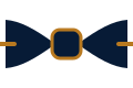
A bow tie should be visible from conversational distance. Dark navy on a black shirt may disappear; a medium burgundy on white remains clear. Contrast can come from value, hue, texture or pattern, but you rarely need all four at once.
Use a simple colour hierarchy
Let the suit or jacket provide the largest colour area, the shirt provide the background, and the bow tie provide the accent. A pocket square should echo one small element rather than copy the tie. Shoes and belt should support the formality of the outfit, not compete for attention.
Pattern scale
When shirt and bow tie are both patterned, change the scale. A fine striped shirt can work with a larger dot or medallion. A broad check usually needs a simple solid or micro-pattern. Similar scales create visual vibration because the eye cannot decide which pattern is dominant.
Reliable colour families
| Bow-tie colour | Easy shirt partners | Typical effect |
|---|---|---|
| Navy | White, pale blue, soft pink, fine stripes | Calm and versatile |
| Burgundy | White, blue, light grey | Warm and formal |
| Forest green | White, cream, pale blue | Distinctive but grounded |
| Black | White | Strict and evening-focused |
| Gold or ochre | White, denim blue, navy jacket | Warm statement |
| Plum | White, pale pink, grey | Rich without being loud |
Novelty patterns
Novelty designs work best when the event welcomes humour and the rest of the outfit is restrained. For ceremonies, memorials, formal business and strict evening dress, choose a pattern that reads as texture from a distance.